Saturday, December 31, 2011

The ECB's easy monetary policy is not getting to the "periphery"

The monetary contraction in Italy has been continuing, with money supply indicators all showing negative growth.  Here are the latest monetary aggregate contributions to the eurozone from Italy's central bank:

 Banca D'Italia: Italy's contribution to the eurozone money supply (percent YOY)

But shouldn't the ECB's continuing expansion of the balance sheet have some positive impact on Italy's liquidity?  Below are the money supply measures showing year over year growth for the eurozone as a whole.

ECB: total eurozone monetary aggregates growth YOY

The growth is moderately positive at around 2% year over year.  This means the liquidity in the eurozone as a whole is expanding, while Italy's is contracting.  But the eurozone is a "closed system" - if the monetary conditions are contracting in one nation, they must be expanding elsewhere to keep the whole euro area liquidity growing at the 2% level.

As expected, that monetary expansion is in fact taking place in Germany with M2 and M3 growth rates in the 6-7% range.


Bundesbank: Germany's contribution to the eurozone monetary aggregates (percent YOY)
What this shows is that liquidity is not getting to the ECB's target, the "periphery", whose economies are facing a recession.  Instead the monetary expansion is ending up at the "core", making the ECB's policy of easing far less effective. This disparity is also setting up a potential future conflict between Bundesbank and the ECB as the impact of monetary policy is not felt uniformly across the eurozone.

SoberLook.com

Friday, December 30, 2011

Zero rates and risk aversion drove mutual fund flows

The trend of preference for fixed income mutual funds over equity funds that started in 2009 continues today. Recent data from Credit Suisse shows clear risk aversion with taxable bond fund flows beating out equities by a substantial amount.

Source: Credit Suisse

What about non-taxable bond funds?  For a while there it was rough going with Meredith Whitney hyping up the doomsday scenario for munis.  Fund outflows in late 2010 spiked, but as investors started to realize that default rates are not going to be nearly as extreme as predicted, investors started coming back, attracted by great after-tax returns.

Source: Credit Suisse

In the equity mutual fund space the period of 2009-2010 saw many investors betting on foreign equities (see chart below), particularly emerging markets.  By the second half of 2011 that bet wasn't working out for them and fund outflows picked up from both domestic and the foreign funds.


Source: Credit Suisse

Some have attributed the equity mutual fund outflows to recent preferences for ETFs because of the ability to trade those intraday. That is indeed the case as equity ETFs have taken market share from mutual funds, though not enough to offset the overall decline.

Source: Credit Suisse
But some of this ETF flow increase has been driven by institutional investors as hedge funds and even endowments got a taste for the liquidity of ETFs. Retail investors on average continue to shy away from equities.

These trends are likely to continue into 2012 as the combination of stresses in the eurozone and zero short-term rates will combine risk aversion with search for yield to favor bond mutual funds over equities.

SoberLook.com

US net oil imports lowest since 1996

As a follow-up to the recent post on energy, a number of readers have asked to see the longer term trends in US oil imports. Here are the charts starting with 1973 showing just the net crude oil imports as well as crude and petroleum products combined.

U.S. Net Imports of Crude Oil (Thousand Barrels per Day)  - source: EIA

U.S. Net Imports of Crude Oil and Petroleum Products (Thousand Barrels per Day)  - source: EIA

The trend in net import declines is clear.

  • US oil and petroleum products net imports (as well as just crude) had peaked in the fall of 2005. 
  • This October's net imports of crude and products were the lowest since February 1996, when they hit 7.34 million barrels per day. 

A large component of this net decline is due to strong US petroleum products exports:
PLATTS: The role of the US as a net product exporter remained solid, and for the first time ever, net product exports topped 1 million b/d, 1.088 million b/d to be precise. Three years ago, total net imports of products were 1.501 million b/d. So the US' net product import/export position has swung more than 2.5 million b/d in just 36 months.
But not all of the reduction in net imports comes from petroleum products.  Crude production and exploration in the US has been on the rise as well.  The charts below show the number of rigs in the US.

US Oil Exploration Rigs (source: Barclays Capital)

US Oil Production Rigs  (source: Barclays Capital)
Number of rigs statistics by state (source: Barclays Capital)

Some of course are quick to call this "propaganda", but these are the facts.  And like it or not, the Obama administration will use these facts to their advantage in the 2012 elections.

SoberLook.com

The government's analysis "extrapolated the bubble"

We all do it. We sometimes fully trust analysis provided by the US government, such as the now famous output gap chart below. This version was published by the Washington Post. It shows that the US total output is significantly below "potential" as determined by the Bureau of Economic Analysis (BEA) and the CBO. But determining the economy's potential is no small task and such a claim should not always be taken for granted.


This analysis looks like an extrapolation of the 2000-2007 capacity growth into the current period.  An alternative version of this chart however is provided by Barclays Capital who believes the US economy's output potential has been growing at a slower pace than determined by the BEA.


Barclays Capital: ...the CBO estimates that output was at potential during the housing bubble years and that any deviation from the trend established during those years represents an output gap. In contrast, our view is that the housing bubble pushed the economy above its potential; thus, we believe the output gap is much smaller.
In fact if one zooms in on this chart, it starts to make much more sense than the original BEA/CBO analysis that assumed the US was producing at capacity prior to the financial crisis. The Barclays chart shows that economic output between 2004 and 2007 had been growing at a rate above what it is normally capable of. One can only interpret this production level above capacity as simply funded by credit, particularly real estate driven credit.

Zooming in on the Barclays chart

Now we can see how the US could potentially produce beyond its capacity, creating an unsustainable output growth, effectively a "bubble". And once this is taken into account, the current output gap may not be as dramatic as shown by the government, which, as Barclays Capital puts it, "is extrapolating the bubble".

SoberLook.com

Thursday, December 29, 2011

LIBOR - the rate at which banks won't lend to each other

The artificial determination of LIBOR as an indication of interbank unsecured rates perpetuated by the financial industry is becoming increasingly more ridiculous.
Bloomberg: “We used to say during the financial crisis a few years ago that interbank rates are rates at which banks won’t lend to each other, and sadly that’s still the case today - Richard McGuire, a senior fixed-income strategist at Rabobank
Indeed this index is not an indication of any real transactions in spite of having permeated many aspects of the financial services industry. The chart below shows the increasing dispersion between the lowest  (HSBC) and the highest (UBS) contributions from a number of banks used to determine this composite index, which is continuing to rise.

LIBOR quotes (highest and lowest) provided to BBA (Bloomberg)
The traditional interpretation of this dispersion would be the varying levels of demand for unsecured term funding. But claiming that HSBC is awash with dollars because their quote is the lowest, while UBS is desperate for term funding because their quote is the highest would be naive. Instead with no real transactions done at these levels, the index calculation process gives financial institutions incentives to manipulate the index.
WSJ: Swiss bank UBS AG disclosed the probe Tuesday in its annual report. The bank said it has received subpoenas from the three regulators and that it believed "the investigations focus on whether there were improper attempts by UBS, either acting on its own or together with others, to manipulate Libor rates at certain times."
There are two reasons for banks to manipulate the index (although real proof of such behavior is hard to come by):

1. In times of crisis, a bank can intentionally quote a low rate to the British Bankers Association (BBA) who computes the index, in order to project "healthy" financial conditions at the firm.

2. On the other hand a good reason to quote a higher level of LIBOR has to do with a bank's current exposure to the index. For example if a bank has a large portfolio of loans paying LIBOR plus spread (which most corporate loans and some mortgages do), the firm may be quite interested in elevating the LIBOR level to boost its revenue. The bank may be funding itself in the overnight markets or via bond issuance, making interest expenses insensitive to LIBOR. Thus by keeping the index artificially high, the net interest income would be elevated. Using rate swaps (fixed for "floating") a bank can dial up or down its LIBOR exposure, giving it a perfect opportunity to influence the BBA's index at different times to increase profitability.

It is surprising that droves of corporate borrowers have not been complaining about having to pay extra on this artificial and possibly manipulated index.  The industry needs to find an alternative to LIBOR, such as term repo rates, commercial paper rates, or some other index where real transaction history is available.


SoberLook.com

M&A based issuance beat out LBOs in 2011

High Yield issuance in the past two years has been dominated by strategic transactions (M&A) rather than financial sponsor (private equity) driven leveraged buyouts (LBO). According to Barclays Capital the trend for 2010 continued into this year with M&A transactions being roughly double that of LBO in 2011.

High yield issuance supporting M&A vs. LBO
There are two key reasons for this trend:

1. As US corporations complete their post-crisis deleveraging and cost cutting while building up cash reserves, they are finding it difficult to grow organically. Strategic acquisitions (M&A) became a quick way of achieving growth. Some of the 2011 transactions have been quite large, for example Kinder Morgan‘s $21 billion purchase of El Paso and Express Scripts‘ $29 billion purchase of Medco Health Solutions.

2. The second reason has to do with the nature of debt covenant packages currently in place in a number of companies.  Many firms have restrictions on liens that can be put on their assets, making it difficult for sponsors to use secured loans.  A number of firms also have "restricted payment baskets" that do not allow cash flows from specific operations to be diverted to pay other debt.  These restrictions make it harder for sponsors to create significant leverage needed for an LBO transaction.  Without this additional leverage the return on equity (ROE) just does not look appealing for private equity firms who typically look for 25-30% ROE.

Going forward M&A activity in 2012 is expected to stay vibrant, driven among other things by low valuations.

TheStreet: Though much of this year's M&A movement came in the earlier part of the year, the U.S. still registered a healthy $841 billion in deals. That's a 24% gain from 2010 and the highest since pre-financial crisis levels in 2007, according to Dealogic.With valuations low, corporate cash balances high and tax changes likely to spur deal momentum, economists' M&A outlook for the coming year is largely positive.

With slow growth in the US, M&A will continue to be the most efficient way for many firms to achieve growth.
Deutsche Bank: "... M&A currently represents, we believe, the best opportunity for growth in a slow organic growth macroeconomic environment in the industrialized economies."

SoberLook.com

Wednesday, December 28, 2011

Precious metals now trade like industrial commodities

With the US dollar continuing to strengthen (starting in September of this year), assets viewed as bets against the dollar are starting to trade with the rest of the "risk assets". In particular precious metals can now be bucketed in the same risk category as some industrial metals that trade with "risk on/risk off" cycle. This had also been the case during some periods in 2009 when gold for example traded with equities. The charts below compare NYMEX gold and silver with COMEX copper.

NYMEX Silver
NYMEX Gold
COMEX Copper
Precious metals have underperformed copper during this period, but the overall trends are similar. Typically gold is viewed as a "safety asset" that should rally when the world is in crisis, while copper is a "risk asset" that trades with expectations for global growth.  But lately the two commodities have been highly correlated as the regression chart below shows.


Gold - Copper regression (Bloomberg)

Since the end of August the correlation coefficient of weekly returns has been around 0.9, which is highly unusual for precious metals.  Some of this is related to the slowdown risks in Asia which may impact demand for both precious metals and industrial metals. 

In the long run, even with this relationship, the "tail risk" scenario may prove positive for precious metals because it will increase the chances of the Fed using its last bullet - QE3.  For now however these commodities will continue to trade together with some industrial metals in the usual pattern of "risk on/risk off".


SoberLook.com

How the markets get spooked by old news

A sudden selloff in EUR makes everyone ask the question - what happened?

EUR/USD (Bloomberg)

In these thinly traded markets it could be a number of things (including some year-end corporate repatriation), but the focus seems to be on a sudden spike in the ECB balance sheet.
Bloomberg: The euro dropped against the yen to the lowest level since 2001 as the European Central Bank’s balance sheet soared to a record after it lent regional banks more money last week to keep credit flowing.
Total Assets at the ECB (Bloomberg)

Of course the next question should be - what caused this spike? The component responsible for the increase is of course the lending to the eurozone financial institutions.

ECB loans to EZ financial institutions (Bloomberg)
The reason for this spike is the additional liquidity provided via Long Term Refinancing Operation (LTRO). The fact that LTRO was tapped quite extensively was well known a week ago.  We also knew that a slug of LTRO will be used to pay down the existing short-term loans from the ECB, but according to Barclays about 200 billion euros would be "new money" into the system.
Bloomberg (Dec 21st): Barclays estimates the loans will inject 193 billion euros of new money into the system, with 296 billion euros accounted for by maturing loans.
This is entirely consistent with the chart above showing roughly a 200bn increase in new loans to the eurozone banks. So where is the surprise that caused the euro to sell off? It seems that market participants are so confused and uncertain about news out of Europe that even information that is well known in advance spooks the markets when it shows up on a chart. It is more about "reminders" than "news" these days.  And with poor liquidity this week, it doesn't take much.
SoberLook.com

Implementation issues continue to plague CDS clearing

The madness surrounding forced clearing of Credit Default Swap (CDS) continues to haunt market participants. The Dodd-Frank concept of "if it can be cleared, it must be cleared" is far easier said than done. Imposing a regulatory framework without understanding the implementation path can create all sorts of unintended consequences. And there is no shortage of implementation issues:

1. The details of the regulatory framework for CDS clearing continues to lack full detail. As the dual regulator (SEC and CFTC) discover things they didn't know about CDS, the framework and implementation become more complex.

2. The "cancel/correct" methodology will no longer apply. If one trades a bond for example and makes a mistake in booking the terms, the trade can be cancelled and corrected in a single transaction. With CDS a mistake would mean that a whole new offsetting trade would need to be booked and a new corrected trade would need to be booked separately, turning a single incorrect transaction into three.

3. The dealer involvement as a clearing agent involves significant capital usage because dealers would be required in effect to guarantee client solvency to the clearing house. That means if a fund transacts a CDS that is cleared on ICE, the fund's clearing agent bank would be on the hook if the fund were to fail. Therefore the clearing agent has to commit capital for transactions they are not a party to. This makes the CDS clearing agent business potentially  unprofitable. It is therefore unclear how committed the dealers are to this business in the long term. Which in turn means that clients will need to set up multiple clearing bank relationships to protect themselves from suddenly losing their clearing bank and being unable to execute.  Setting up these relationships tends to be expensive and time consuming.

4. But having multiple clearing banks is not a great outcome either because if a client clears a CDS buy with one dealer and the same CDS sell with another dealer, the two can not be offset even if the positions are held on the same clearing house (ICE or CME).

5. The two clearing houses ICE and CME contracts are not fungible. If a client clears a buy CDS on ICE and a sell CDS on CME, the two can not be offset and the clearing house must be specified at the time of the transaction. Also because of different capital requirements by the clearing houses (#3 above), CDS pricing for clearing on ICE or CME may actually be different. Thus a client would need to maneuver among multiple clearing banks and two clearing houses without the ability to easily move/offset among the platforms.

6. Basis trades are still a problem.  If a fund is short a bond and a CDS in the same credit, the majority of risk is offset.  However the fund will have to post margin on the short bond to their prime broker and margin on the CDS to the clearing house with no opportunity for any offset.

7. The margin requirements on ICE and the CME are completely different. The biggest difference in margin methodology has to do with the so called "jump to default" (JTD). The clearing houses are trying to put protections in place to address not just movements in spread, but also a sudden default. It is effectively a "concentration" charge that drops off as the portfolio becomes diversified as shown in the CME chart below.


If a fund sells protection on a single name CDS (as opposed to an index), and that single trade is all they have on CME, the margin they would need to post becomes enormous relative to what is charged by ICE who has a much more realistic margin charge.  Posting a margin of 80% on a CDS is at least three times what one would post on a corporate bond, even though the risk associated with a corporate CDS and a corporate bond is very similar. Therefore unless one has a diversified portfolio of CDS, clearing via the CME for one or two positions would become prohibitive.  This tremendous difference in margin requirements is yet another issue plaguing CDS clearing implementation in the US.

The documents below describe in some detail the risk/margin methodologies of the two clearing houses ICE and CME.

ICE Risk Presentation


CME CDS Risk Management - Margin

SoberLook.com

Tuesday, December 27, 2011

An update on China's property market correction

Here is an update on the post describing the property markets price correction in China and the authorities' reaction to the impending downturn.
--------------------------------------------------------------------------------------------
Dear Professor Chovanec:

We are trying to reconcile the numbers in your fascinating article on China property markets:
"According to the property agency Homelink, new home prices in Beijing dropped 35 percent in November alone"
With this Bloomberg report:
"New home prices in China's four major cities of Shanghai, Beijing, Shenzhen and Guangzhou each retreated 0.3 percent from October, the biggest monthly falls for these metropolitan areas this year, according to data from the statistics bureau."
That's a factor of over 100 and can have enormous implications globally.  Can you please elaborate.

Much appreciated
Sober Look
--------------------------------------------------------------------------------------------

From Professor Chovanec (professor at Tsinghua University's School of Economics and Management in Beijing, China):

"Correct, there is a very large discrepancy between the official price statistics and what is being reported by the property agencies. I'm not sure why this is so, since I don't know what methodologies they each are using. I suspect its due both to the coverage of the survey and how prices are recorded -- ie, asking prices vs. transaction prices. There is currently a BIG gap between asking prices and what homes are actually being sold for, and that doesn't even include hidden forms of discounts like buy-back guarantees, free gifts, etc.

 The original report on the Homelink data can be found here:
 http://estate.caijing.com.cn/2011-12-01/111467052.html "

A reader comment (update):

"The bigger reason for the discrepancy which I think Professor Chovanec didn't realize, is that when a block of new apartment building is offered for sale, an average price is set and that price is difficult to change (or else the people who bought at higher prices may demand compensation) until the block is all sold (which lasts from a few months to more than a year). In the Caijing article the 35% price drop was specifically calculated from the newly offered blocks, for which the developer could set prices to whatever they see fit. The Bloomberg number ... was from all units.

Therefore the 35% price drop is real. But the units sold at 35% discount may not be representative to all unsold new apartments. Beijing has 1-2 hundred thousands unsold units. I am sure of the 10 thousand RE developers in China some are getting desperate. Note that in the same Caijing page Professor Chovanec quoted, prices of second hand homes in Beijing were down 3% (that is transaction prices) compared with October. Also indicating that prices falling off the cliff hasn't happened (yet)"
SoberLook.com

Six common myths about global and US energy issues

At times politicians, bloggers, and even financial professionals make comments about US domestic and global energy issues that are factually inaccurate.  When you are having a cocktail at the New Year's Eve party in a week, ask around what people think about energy dependence, production, global supplies, etc. and you may hear some of the following six myths:

Note: wherever units are not provided, the assumption is million barrels per day

Myth #1: US crude oil comes from the Middle East/Persian Gulf.

Not true. A large portion of imports is coming from Canada and other non-OPEC nations.  Only about 18% is coming from the Persian Gulf

Imports from OPEC nations - million barrels per day (source: EIA)
Imports from non-OPEC nations (source: EIA)

Here is the OPEC vs non-OPEC trend for the last 3 years:

Source: EIA
Myth #2: The US domestic energy production continues to dwindle.

Not true. The US domestic energy production is in fact increasing.
US domestic production  (source: EIA)
Eurasia Review: Oil extracted from shale deposits in North Dakota, Montana, and Texas has reversed years of decreasing American oil production, leading to increased domestic extraction and thus reducing dependence on overseas oil from 60 percent of U.S. consumption in 2005 to a little less than half now.

Myth #3: If the US produced more of its energy requirements, the price at the pump would be lower.

This is a common misconception and is not true in the global economy.
Eurasia Review: ... it would not matter much if the United States produced 100 percent of what it consumed or whether it all came from the Persian Gulf, because the price at the pump is determined by the worldwide oil market. If more oil is put on market from anywhere around the globe, the price will go down; similarly, if oil production is cut anywhere in the world and not offset by increases elsewhere, the price will go up.
Myth #4: US energy needs are constantly growing.

Not true.
WSJ:   U.S. customers have been pulling back in part because an anemic economic recovery has left millions still looking for work. In August, U.S. drivers burned 7.7% less gasoline than four years earlier, when gasoline usage peaked.
Here is a chart showing the US energy consumption for the past three years (see the attached EIA document for more detail).

US energy consumption (source: EIA)

Myth #5: The US is not an energy exporter because it has no excess energy to export.

This is true on a net basis (imports less exports), but just the energy exports have been on the rise.

Source: EIA

In particular the US exports a great deal of coal and refined products because of efficient refining capabilities:

Source: WSJ

With higher exports, the net imports (imports minus exports) have been declining:

US net imports (source: EIA)

Myth #6 - this one will get the conversation really going: World's oil production has already peaked and as the reserves dwindle, more wars will be fought over the scarce energy resources.

Not true.
Eurasia Review  First of all, “experts” have been repeatedly predicting the depletion of the world’s oil reserves since the late 1800s, but it never seems to happen. New technologies and periodic higher prices make previously uneconomic deposits viable—such as the tar sands and shale oil that have recently become economic—thus sustaining world production. Second, academic research has indicated that conflicts are much more likely over allocation of money received from abundant natural resources (for example, fighting in Nigeria over who gets proceeds from oil exports) than conflict over scarce resources that can be priced in a market. That is, it is cheaper to pay the market price than to go to war.

For those interested in more detail about the data presented here, please see the attached EIA Monthly Energy Review (below).

Enjoy that New Year's Eve party...


EIA -
SoberLook.com

Monday, December 26, 2011

CLOs and the new bank capital rules

In the heyday of credit structuring the rating agencies had been far more successful in rating the securitizations of corporate debt than of mortgage debt. Collateralized Loan Obligations (CLO) tranches rated AAA had not lost principal during the 08-09 crisis (except for a couple of fraud cases), although often traded as low as 60-70 cents on the dollar because of uncertainties around corporate default rates. During the crisis banks like JPMorgan had bought significant amounts of the AAA tranches at large discounts and made enormous returns as the market began to realize that corporate defaults among leveraged companies will continue to stay subdued.

As a bit of background, between 2004 and 2007 CLO issuance had spiked tremendously as asset backed commercial paper (ABCP) issuance allowed banks to keep tranches in CP conduits and off their balance sheets using what used to be called "regulatory capital arbitrage".  This allowed for ever larger leveraged buyout (LBO) transactions including firms like TXU and First Data.

CLO Issuance in $billion per year (source: LSTA)

As ABCP demand collapsed in late 2007 (driven primarily by concerns about subprime mortgages), CLO issuance collapsed as well.

ABCP outstanding (source: the Fed)
This year some CLO deals got done (about $13 bn) and the hope was that the business, in spite of being a fraction of pre-crisis levels, would continue to grow. But given the history of structured credit, the recent news that capital requirements will be increasing on AAA CLO paper held by banks is not a surprise.
FT: Under existing Basel rules, large banks using “internal-ratings based” models are required to set aside just 0.56 per cent of the market value of triple A rated CLO securities as capital against losses. That would increase to a minimum of 1.6 per cent under the proposed US system, and then jump to 8 per cent if cumulative losses on a CLO exceed 4 per cent.
Many new CLO deals have 25-30% subordination, making it nearly impossible to "pierce" the AAA, particularly given that most loans are senior secured corporate obligations.  However over a few years most CLOs will accumulate losses of 4% or more - this is typical for a pool on non-investment grade loans.  So the capital charge for holding the AAA tranche will suddenly become equivalent to holding some corporate loans directly. Yet these losses on the CLO will flow to the lower tranches, not the AAA.  This new capital requirement will certainly make it capital inefficient to hold AAA paper on banks' balance sheets, particularly as it gets closer to maturity.

With CLO issuance in 2012 expected to be only slightly up from this year, the new regulation may significantly cut into this business.  Banks tend to be the largest holders of the most senior tranches, making it almost impossible to structure a new CLO without a commitment from a large financial institution.  In turn this will reduce demand for institutional loans (corporate loans of leveraged companies) that form the collateral pool for CLOs.  When combining this regulation with new rules impacting the corporate bond market, funding costs for corporations, particularly the "middle market" (mid-sized) firms in the US will increase.  This is yet another example of "unintended consequences" that some of the new regulation may introduce into the US economy. 
SoberLook.com

Sunday, December 25, 2011

Will Obama be reelected? Just watch the stock market

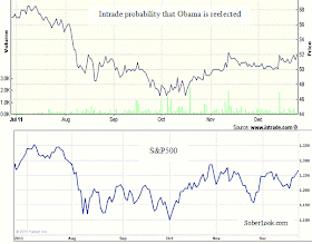
President Obama's 2012 Intrade reelection odds now stand at about 52%, roughly a 2% increase in the last few days. What has changed to make the "crowds" assign a higher probability to this event? The payroll tax situation remains unsolved, the deficit issue still looms large, and the Republican candidates still have the same issues they had a week ago. The one thing that did change however is that we've had a stock market rally. Is there a relationship?

The charts below show that day-to-day the relationship may not be strong, but the similarity in trends is unmistakable. This is a six-month chart that takes us through the worst of the crisis (the Intrade contract wasn't very actively traded prior to that).  The two track well during earlier period as well, except when Osama bin Laden was killed, the President's reelection chances spiked for a short time.  The market went up too, but not nearly as much.

The top chart is the Intrade probability of Obama becoming president for the second term, while the bottom chart shows the S&P500 index.

Obama reelection probability vs. the S&P500
This is by no means a proof of causality, but the relationship may indicate that whatever factors drive the equity markets may be the same factors that benefit an incumbent president.  Once again we may have an indication that politics and the economy are even more inseparable than we imagined.  

SoberLook.com

The correction in China's property markets and the government's plan to address it

To understand the issues faced by China and the steps the nation is planning to take, one needs to look no further than the country's official press. It's a bit like corporate press releases - one should read them with a healthy level of skepticism, yet the tone, the timing, and some of the content can provide good insight.

We start with the following quote from Wei Jianguo, secretary-general, Center for International Economic Exchanges:
Xinhua:  For China, the year of 2012 will be the most "unpredictable, complicated, grim and difficult" year since the financial crisis three years ago... "We should get ready for trade deficit next year..."
...
China should also prepare for trade wars, as many countries are working to boost exports to protect themselves amid the dim global economy, he added.
China's officials certainly had made downbeat statements about the economy before, but for a statement to be this negative, the Party is trying to get a message out. The bosses are starting to get quite concerned about the state of China's economy. This statement says: get ready for hard times ahead, but know they are all caused by external factors, such as "dim global economy" and "trade wars". What may prompt the Chinese leadership to turn so negative on China's growth?

There are multiple and complex issues facing China, but one of the most troubling is a potentially unprecedented correction in the real estate market.
Council on Foreign Relations: According to the property agency Homelink, new home prices in Beijing dropped 35 percent in November alone. And the free fall may continue for some time. Centaline, another leading property agency, estimates that developers have built up 22 months' worth of unsold inventory in Beijing and 21 months' worth in Shanghai.
A crash of this magnitude is clearly an unwelcome event for Party officials as they begin to prepare to deal with this issue. A 35% correction in a month feels like a panic, but this event has been in the making for some time. A glut of development projects and easy money available for developers (both debt and equity) had been widely discussed over two years ago. In fact this may not be unique to China, with "bubble" property and other asset markets correcting across several nations of Asia (again discussed over two years ago).

The economic numbers coming out of China, though sometimes suspect, clearly show signs of deceleration. It started with a fairly rapid monetary policy tightening to fight inflation resulting in the M1 money supply growth dropping recently below 8%.
China M1 Growth (Bloomberg)
Now we also see signs of a decline in growth of credit, particularly loans for fixed asset development. It's interesting to note that both the money supply measure and the fixed asset loan growth peaked around the same time - in late 2009 to early 2010.

Growth in Loans for Fixed Asset Development (Bloomberg)
In the last two years, as banks have tightened credit to China's property developers (chart above), these firms tapped the capital markets in order to raise debt capital via bond issuance. But recently, particularly in the wake of the Sino Forest fiasco, investors are beginning to demand unsustainably high premium to own Chinese developers' debt. As an example consider the Evergrande Group, one of China's largest and and "asset rich" developers. A newly issued bond by Evergrande, the 9.25%, 5-year note now trades at 70 cents on the dollar with an over 20% yield.  In fact the yield spiked above 26% during the Sino Forest scare, as investors were dumping all Chinese bonds, but had since recovered.  The yield however continues to climb with uncertainty about property markets escalating.

Evergrande 9.25%, 5-year bond yield (Bloomberg)
 
This is by no means unique as can be seen in another example - Greentown, also a large and well known property developer.  The 9% bonds maturing in just two years are extremely volatile, currently trading at 71 cents on the dollar with a yield of over 30%.

Greentown 9% bonds maturing 11/2013 - yield (Bloomberg)
This means that these developers are now not only cut off from significant new lending, but also effectively shut out of the capital markets and new bond issuance.  It is unclear how these developers will be able to pay back their debt, if the property markets seize up.  This will not only hurt the bond holders, many of whom are outside of China, but may deal a severe blow to China's banking sector that is awash with debt to property developers.

As developers begin to struggle, the property markets are having a knock-on effect on the broader economy.  As an example, the steel production industry is beginning to slow markedly (the bulk of steel produced in China is used in construction).  The chart below shows pig iron output dropping off at the rate similar to 2008.  Note that pig iron is the raw (carbon rich) iron that is in the earliest stage of refining.  Reduced orders/demand would first show up in the earliest stages of production. Prices on pig iron also declined rapidly, from 3900 to 3200-3500 CNY/metric tonne in a matter of two months.

China's total pig iron output monthly, 10000 tons (Bloomberg, Antaike Information Development)
Other areas of the economy are showing signs of strain as well.
Council on Foreign Relations: Chinese steel production -- driven in large part by construction -- is down 15 percent from June, and nearly one-third of Chinese steelmakers are now losing money. Chinese radio reports that half of all real estate agents in the southern city of Shenzhen have closed up shop. According to Centaline, more than 100 local government land auctions failed last month, and land sale revenues in Beijing are down 15 percent this year. Without them, local governments have no way to repay the heavy loans they have taken out to fund ambitious infrastructure projects, or the additional loans they will need to keep driving GDP growth next year.

In a few cities, such as coastal Wenzhou and coal-rich Ordos, the collapse in property prices has sparked a full-blown credit crisis, with reports of ruined businessmen leaping off building rooftops; some are fleeing the country.
As the "Dutch tulip" style property correction is making its way through the broader economy, China's leaders are looking to implement solutions to address this economic downturn. Their ultimate concern continues to be the risk of social unrest.
Council on Foreign Relations: Crowds of owners who had recently bought apartments at full price converged on sales offices throughout the city, demanding refunds. Some angry investors went on a rampage, breaking windows and smashing showrooms.
Here are some of the government's initiatives aimed at heading off the effects of this economic downturn - directly from China's official media:

1. Rapidly expand credit to medium and small businesses.
Xinhua: The Chinese government should especially give support to medium and small businesses as they would go through a hard time when the E.U. market starts to shrink, leaving them no time for a business transformation.
2. Improve domestic demand and increase incomes - particularly for the poor.
Xinhua (a different article): With the external demand waned, the Chinese government has attempted to turn to domestic consumers to take up the slack. The country vows to expand domestic demand next year and increase residents' income, especially for disadvantaged groups.
3. Improve social security and affordable housing.
Xinhua...the government also needs to improve its social security system as well as increase construction of affordable houses and public rental houses.
The dirty secret of China's property development boom has been the fact that these were largely luxury investment properties, homes that most ordinary Chinese could not afford.  It is not surprising therefore that the focus shifted to affordable housing.  China's government currently has enormous financial resources at its disposal (such as tax cuts, monetary easing which has already started, etc.), that will allow the nation to soften some of the blow from this inevitable economic downturn.  But it's unclear just how severe the downturn will turn out to be and the support for the economy would only be possible if social unrest does not become a problem. 2012 will be a decisive year for China and many of its trading partners.


SoberLook.com

Friday, December 23, 2011

The "personality premium" of Bill Gross: EAD vs. PHK

Bill Gross
Success in asset management is as much about personalities as it is about performance.  The "personality premium", a premium investors are willing to pay to have a specific individual manage their money, can vary significantly across investment funds funds with similar performance.  Rarely is such premium more extreme than in the case of Bill Gross of Pimco.  It is best observed in closed-end funds, exchange traded fund vehicles that have a fixed number of shares. No two funds are alike, and in addition to the personality premium, the fund's track record, management style, portfolio composition, etc., can all have an impact on the premium or discount to NAV.  To gauge the premium one can therefore look at funds in the same asset class managed by well recognized large organizations.
Let us compare two closed-end high yield bond funds, one managed by Pimco, the other by Wells Fargo.  The Pimco fund is called "Pimco High Income Fund" (PHK) and the Wells Fargo fund is the "Wells Fargo Advantage Income Opportunities Fund" (EAD).  Both have a similar net expense ratio of just over 1% and both have the bulk of the assets in junk bonds.  PHK has about $1.4 bn is assets, while EAD is about $0.65 bn.

First we compare the funds' year-to-date returns.  EAD is clearly the winner with 16% total return vs. Pimco's PHK of 6.4%.

EAD vs. PHK total return (Bloomberg)

Often superior returns are achieved by taking higher risks, potentially via higher leverage or higher duration.  So our next comparison is the relative risk profile of the two funds.  A very simple way to measure this is to run a shock scenario on the funds' holding by widening spreads of the portfolio bonds.  Below is the 100bp shock scenario comparison between the two portfolios.  EAD NAV would end up dropping by 14% if all bond spreads widen by 100bp and by 13% if only the high yield bonds are widened by the same amount (both funds hold some investment grade bonds.)  The corresponding numbers for PHK on the other hand are down 20% and down 19%.
 
EAD Scenario Analysis
PHK Scenario Analysis
What this is telling us is that PHK is more risky than EAD, mostly due to the fact that  PHK has a higher average duration of 6.5, vs. EAD's duration of  3.4. EAD assets have a slightly lower average rating, but PHK holds more financial sector exposure.

Now that we've established that EAD has a better performance and lower risk profile than PHK, let's take a look at the two funds' premium to NAV.   EAD trades at 7.3% premium to NAV, which is quite reasonable.

EAD Premium to NAV

Pimco's PHK on the other hand trades at close to 70% premium, almost 10 times the premium of the Wells Fargo fund.  Those who purchase PHK therefore pay nearly 70% more than the value of the assets held by the fund just to have their money managed by Pimco.

PHK Premium to NAV
We've shown that it's not the performance, particularly through this crisis, and it's not the risk profile that can account for such drastic difference. The premium difference between these two funds of over 60% is in fact the "personality premium" commanded by Bill Gross.

An obvious question here is can this be turned into a trade, such as going long EAD and shorting PHK.  Such a transaction is difficult to achieve because PHK is notoriously hard to borrow in order to short it.  And the outcome is by no means certain because the personality premium could persist for a long time as people continue to watch Bill Gross on CNBC and pay enormous premiums for the honor to have their money managed by such a celebrity.


SoberLook.com